Vita Serena
A women’s wellness brand built end to end — name, identity, messaging, store, acquisition, email and automation, from one team.
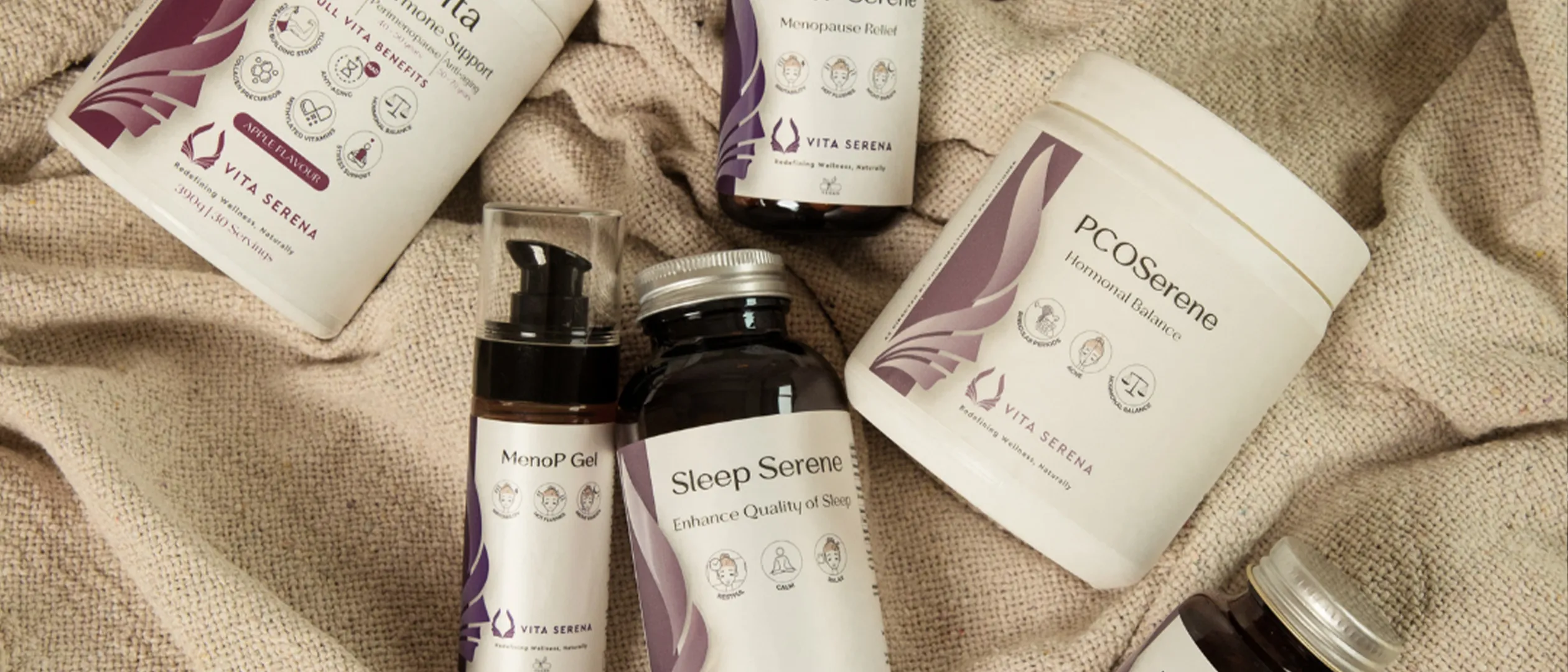
Starting from nothing
No logo, no messaging, no store, no audience. That is unusual for us and it is the reason this project is the clearest illustration of what an integrated team actually changes: every decision downstream inherited a decision made upstream, by the same people.
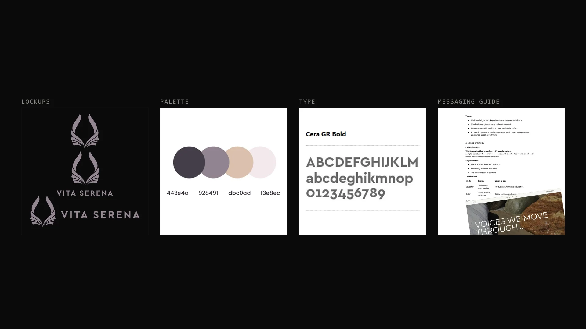
Identity and language
Mark, palette, type and a written messaging guide covering how the brand talks about a sensitive category — symptom relief and lived experience rather than medical claims. That guide then governed the store copy, the ads and the emails, which is why they sound like one brand.
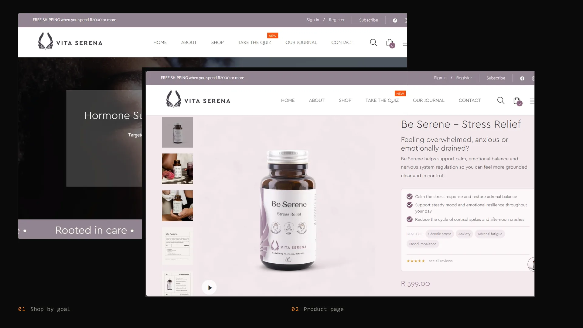
The store
A custom Shopify build organised by health goal rather than by product name, because customers arrive describing a problem, not a SKU. Bundles, reviews and subscription-style repeat purchase sit inside that structure rather than bolted on.
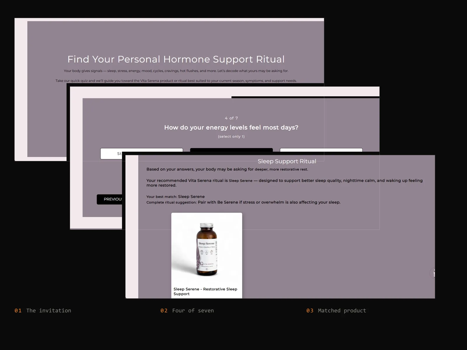
The quiz
A sixty-second hormone support quiz that routes a visitor to the right product instead of leaving them to self-diagnose from a grid. It is the highest-intent path on the site — and it doubles as the cleanest way to capture an email, because the result is worth having.
Acquisition
Meta and Google managed against the same messaging guide the store was built from. Creative, landing experience and follow-up were designed together rather than briefed separately to three suppliers who never speak.
Retention and automation
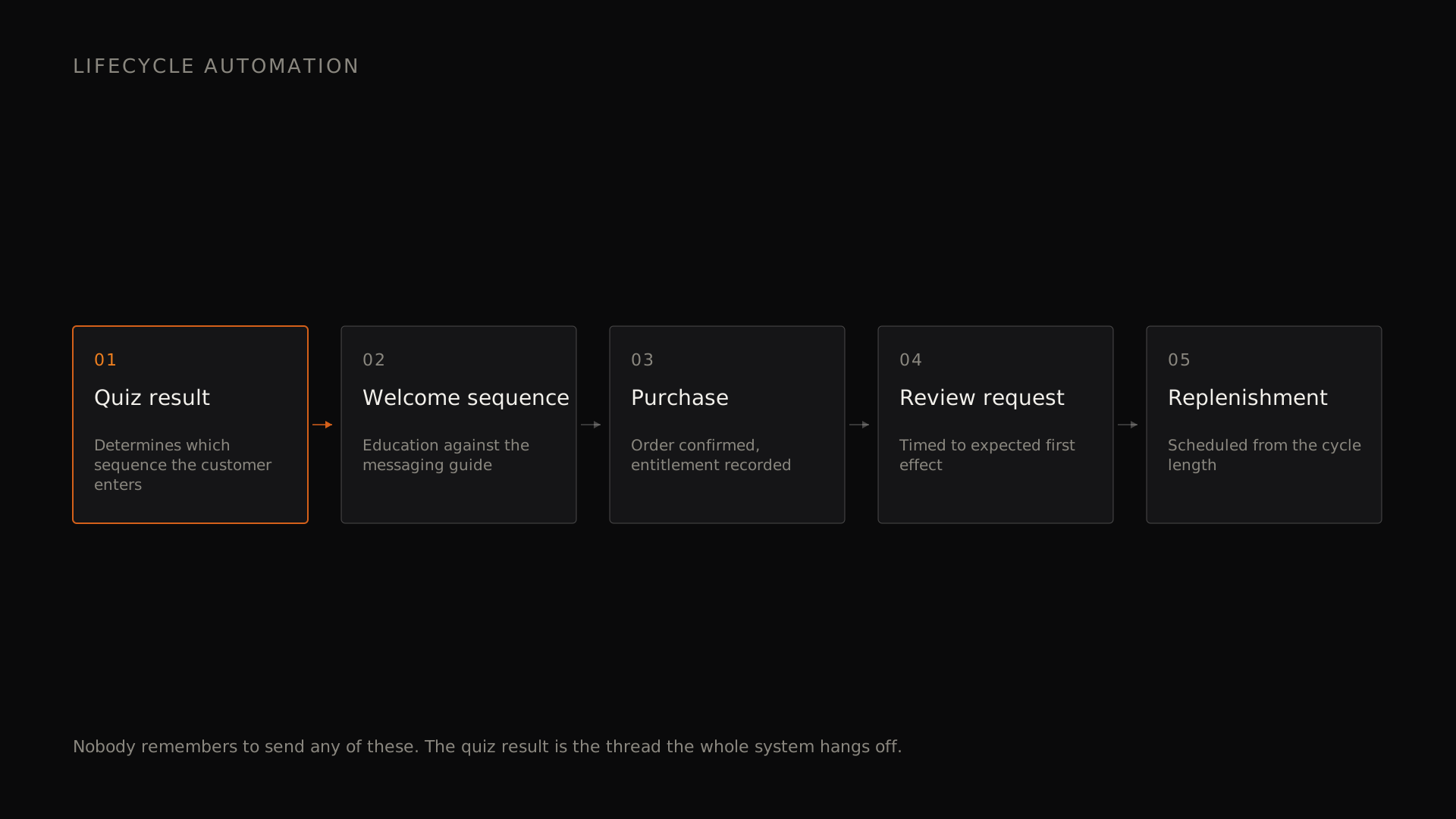
Lifecycle email built on the quiz result and purchase history, with the store wired so an order, a review request and a replenishment reminder happen without anyone remembering to send them.
What it proves
Eight disciplines, one accountable team, one set of decisions. This is what we mean when we say the alternative to disconnected suppliers is not a bigger agency — it is a smaller, better-connected one.
- Brand, design & build — futr
- Acquisition & lifecycle — futr
Bring us a similar challenge.
Tell us what is changing in the business and why now. If we are not the right partner for it, we will say so in the first conversation.